30 Paintings in 30 Days Challenge

Call  me crazy, but I decided to participate in the 30 Paintings in 30 Days painting challenge on Instagram, #pcj30in30, along with hundreds of artists from around the world. I've seen other artists do Challenges on Instagram but mostly those were self-directed. This one started on September 1st.  Not knowing what to expect, or if I would be able to keep up, I decided to jump in anyway on very short notice.  Follow my painting journey as I explore color.  To see more work from the challenge check my Instagram page @christinesauerstudio.

Studio work table.  To keep the process manageable I started by creating 9,  8x6" paintings all at the same time.  Then I worked on each one a little at a time.  It's always surprising how much time small paintings can take. &nbs…

Studio work table.  To keep the process manageable I started by creating 9,  8x6" paintings all at the same time.  Then I worked on each one a little at a time.  It's always surprising how much time small paintings can take.  The goal is not to overwork them, lol!

Why do a challenge? A short, focused timeline can help you push your work along.  No time for excuses, procastination or distractions!  I decided to set a goal of exploring colors and palettes that are not as familiar to me.   Working alongside other artists also is a good motivator to keep the energy going.  At least, this is what I'm hoping for.  The journey will be interesting no matter the outcome. 

 For the first several days of the challenge I created the abstract "Urban Flora" series, 8x6" acrylic on paper, inspired by the ferns and flowering bush in my backyard.  I'm pushing my color comfort zone with a palette of Red Oxide, Quinacridone Nickel Azo Gold, and Manganese Blue.  Plus Vat Orange and Bright Yellow were added to this palette for a bit of kick.

©Christine Sauer "Urban Flora I" 8x6" acrylic on paper

©Christine Sauer "Urban Flora I" 8x6" acrylic on paper

   To see more images from my 30 Paintings in 30 Days Challenge join me on Instagram @christinesauerstudio.  I'll be posting the series for sale there as well.

"Night Flora"


Several months ago I started a new group of abstract floral paintings.  After posting a couple of my first Flora explorations on Instagram (@christinesauerstudio) several months ago, Mary Beth Shaw from StencilGirl contacted me for a post.  I’m so appreciative of being featured there!  I really enjoy working with the very creative designs from Stencil Girl stencils.  Here’s a bit of the process.

The lush and abundant flora of New Orleans inspires me.  I love photographing my garden and the floral streetscapes in my neighborhood, even at night when colors and forms take on a mysterious and luminous quality.  Photos are used for inspiration though I work primarily from imagination and through exploration of paint and other materials.  Part of the process when starting new work is to explore a variety of approaches on a small scale.  Creating rich, varied and textured surfaces is a big part of what I love to do.  GOLDEN’s Glass Bead Gel is one of my favorite mediums and I keep finding new ways to incorporate it into my work.

©Christine Sauer, “Night Flora” in process, 10x8”, acrylic on canvas board

©Christine Sauer, “Night Flora” in process, 10x8”, acrylic on canvas board

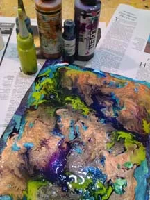
For this exploration, a repurposed, experimental canvas board that already had paint and texture on it was used.  A rigid surface such as a panel or cradled panel would also work well.  The process started by pouring a variety GOLDEN High Flow acrylics in a freeform manner onto the surface.  I spritzed the paint lightly with H2O to help the colors merge and flow into each other.

©Christine Sauer,  10x8" Repurposed Canvas Board

©Christine Sauer,  10x8" Repurposed Canvas Board

GOLDEN High Flow colors used for pouring include Anthraquinone Blue, Iridescent Copper, Permanent Violet, and a mix of Green Gold with Hansa Yellow Light.

GOLDEN High Flow colors used for pouring include Anthraquinone Blue, Iridescent Copper, Permanent Violet, and a mix of Green Gold with Hansa Yellow Light.

 1)      Let this dry over night before doing the next stage.  Because the colors merge in unpredictable ways, it‘s always fun to see how the pour has developed overnight!

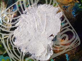
©Christine Sauer,   GOLDEN Glass Bead Gel applied through stencil

©Christine Sauer,   GOLDEN Glass Bead Gel applied through stencil

2)      The next layer is GOLDEN Glass Bead Gel applied with a palette knife through stencils.  Maria McGuire’s “Ripple” stencil, shown here, and “Floral 2” by Traci Bautista were used in small sections and turned different directions to create an organic, abstract design with a sense of movement.  I love the gritty texture of the Bead Gel as a contrast to the smoother poured paint. Let dry approximately 4 hours or until it has dried clear before adding paint on top of the Bead Gel. TIP:  Carefully lift stencil.  Use a small color shaper to clean up between spaces if needed to keep shapes clean edged.

©Christine Sauer, (above) Wet Glass Bead Gel design (below) Dried Glass Bead Gel.  Fluid Acrylic colors painted on top of dried Glass Bead Gel.

©Christine Sauer, (above) Wet Glass Bead Gel design (below) Dried Glass Bead Gel.  Fluid Acrylic colors painted on top of dried Glass Bead Gel.

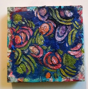
3)      All colors were mixed with Iridescent Pearl to create sheer, luminous color and to provide high contrast to colors below. A small Filbert brush was perfect for the job. Sometimes it’s hard to see the dried Bead Gel Shapes.  I used the photo of the wet Bead Gel as a reference. TIP:  Iridescent paint dries quickly.  Spritz your palette with a little H2O periodically while painting.

©Christine Sauer   10x8", acrylic on canvas board, completed layer of Iridescent colors.

©Christine Sauer   10x8", acrylic on canvas board, completed layer of Iridescent colors.

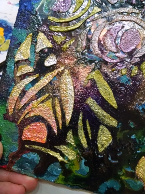
The above piece is still a work in progress and will still get some tweaks.  Below is another iteration of this process.  They have even more texture than the above piece.  For these I created a painted tissue layer first.  Then a dark glaze layer was added that allowed for the tissue colors to show through a bit prior to adding the Glass Bead Gel flora.

©Christine Sauer, “Night Flora” explorations- (above) 10x8”, acrylic, mixed media on canvas board (below) work in process, 8x8” acrylic, mixed media on cradled panel,

©Christine Sauer, “Night Flora” explorations- (above) 10x8”, acrylic, mixed media on canvas board (below) work in process, 8x8” acrylic, mixed media on cradled panel,

STUDIO TIP #4

 Art Journals and Sketchbooks are Invaluable for the Creative Process   I have to admit that I have a love affair/addiction with art journals and sketchbooks.  The sketchbook/journal section of an art supply store always draws me in like a magnet.  It takes a lot of will power to resist buying more!  Sketchbook work was always part of my curriculum as an arts educator, even when teaching young students. Many years ago, one of my high school students who knew that I liked them even gifted me a large, beautiful, fabric covered journal that I still use today. 

Journals and sketchbooks are an invaluable part of the creative process. They are receptacles to collect the many thoughts, ideas and visual info that roll around in my mind.   I don't work in them sequentially but in a more random manner as the need arises.  In my stash, there's at least one for almost every kind of art related-purpose;  taking notes at art lectures, making paint sketches, paint recipes, title ideas for artwork, drawing, doodling and more. They are all shapes, sizes and materials. (photo below)  

©Christine Sauer , several journals from my collection

©Christine Sauer , several journals from my collection

The paint journals are used for warm-up paintings, as reference for palette ideas, to explore color mixing in a variety of ways and for experiments using paint offloaded while working on other projects.   I have competing tendencies/urges when painting so the journals are a great place to get some of that out of my system too!  Favorite types of journals are spiral bound with heavy watercolor or mixed media paper. (photo below)

©Christine Sauer,  paint journal experiments with acrylic paints.  STUDIO TIP:  Use wax paper or cooking parchment as interleaving to keep pages from sticking together.

©Christine Sauer,  paint journal experiments with acrylic paints.  STUDIO TIP:  Use wax paper or cooking parchment as interleaving to keep pages from sticking together.

I'm starting a new journal, one for mixed media collage using my stash of monoprints created on Gelli-plates.  Customizing the journal cover is so important as it sets the tone for the creative exploration and play inside.  I thought I'd share this super simple process that I used customize it.  I repurposed an old blank book made over twenty years ago at a bookmaking workshop, but any journal or sketchbook will do as long as paper and fabric can be glued to the surface.

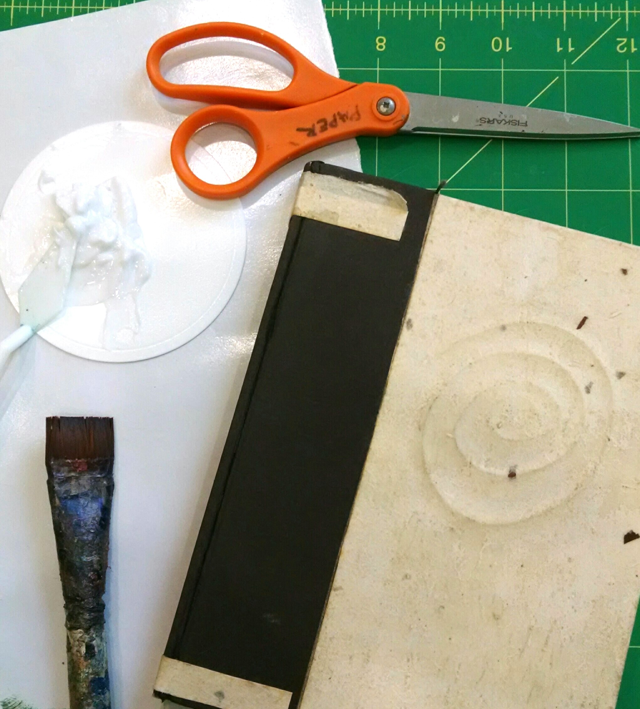
Materials needed:  Golden Soft Gel Matte, old paint brush, a journal, scissors, variety of collage papers snd fabrics.  I like to use Matte Gel because it keeps the character of the paper and fabric and it's not sticky like the Gloss versi…

Materials needed:  Golden Soft Gel Matte, old paint brush, a journal, scissors, variety of collage papers snd fabrics.  I like to use Matte Gel because it keeps the character of the paper and fabric and it's not sticky like the Gloss version.

Step 1)    Brush one layer of Golden Soft Gel Matte (GSGM) over the whole cover to seal and let dry to the touch about 5-10 minutes.

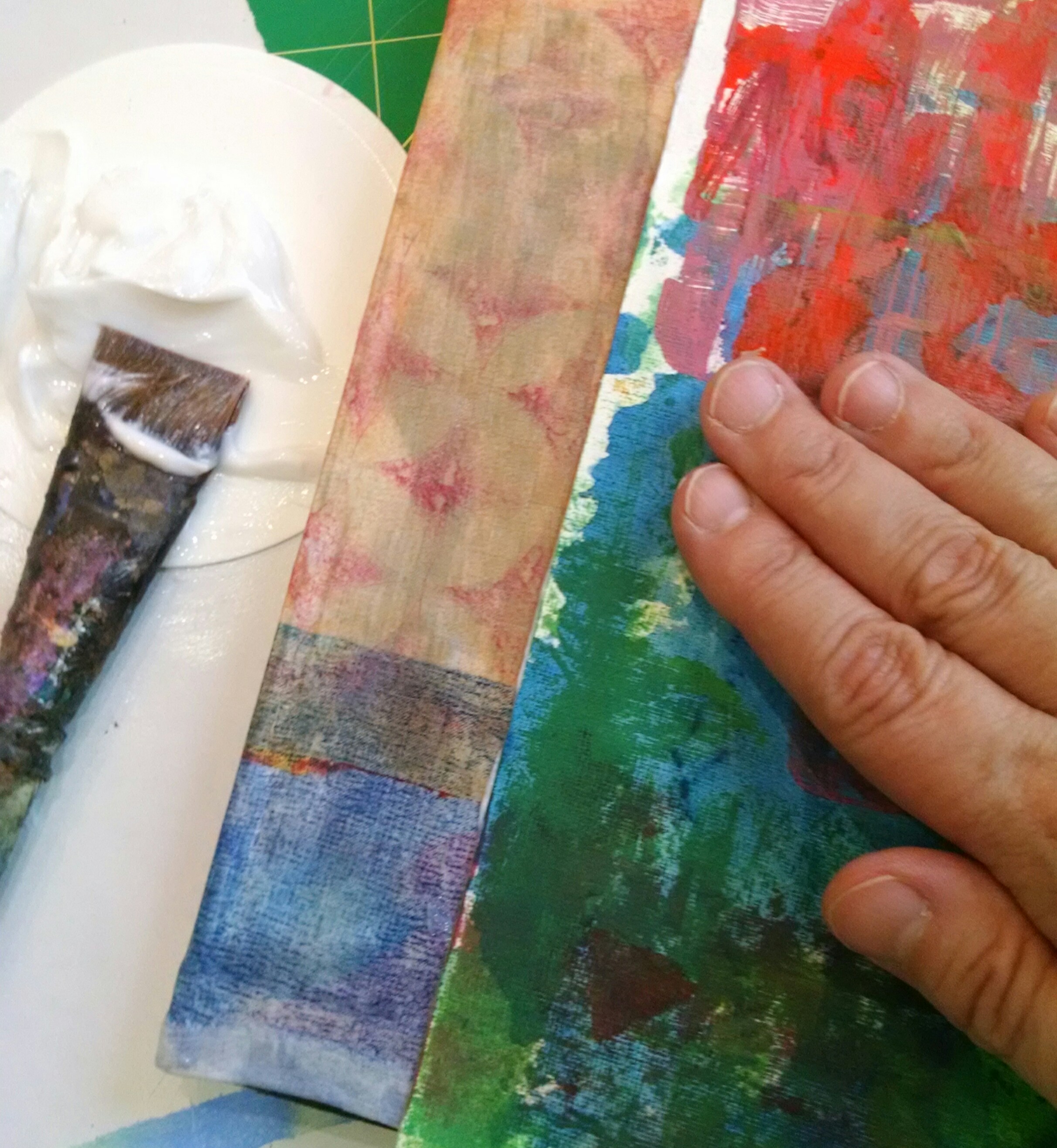
Step 2)   Choose just a couple of the fabrics and papers you might like to use as a base layer and start auditioning them to find an interesting arrangement.  In this case I am using an informal grid to organize the design.  Cut your choices to size.  In the photo I used a piece large enough to wrap around the spine of the journal to reinforce it since the journal will be opened and closed often. Cut paper so that it will also wrap around to the inside of the covers for a more finished look.  Brush a generous amount of GSGM on the journal cover and paper for good adhesison.  Burnish by hand for good contact.  

©Christine Sauer, covering repurposed journal with monoprinted fabric and paper

©Christine Sauer, covering repurposed journal with monoprinted fabric and paper

3)  Continue layering with smaller pieces of monoprinted paper and fabric until the design is satisfying.  In this case elements such as the bubble wrap and stenciled prints were added for contrast.  The collage continued inside the covers as well.

©Christine Sauer, collaged front and back journal cover using monoprinted paper and fabric.

©Christine Sauer, collaged front and back journal cover using monoprinted paper and fabric.

4)  Finished book below.  Last step is to use a generous coating or two of GSGM on top of the collage.  This will protect the paper a bit and provide a good barrier surface if you want to add a bit of paint.  If you are interested in learning more about creating collage using monoprints join me for the "Collage Explorations"  Workshop on June 16 and 17, 2017,  at David Art Center, Metairie, LA

 ©Christine Sauer  Finished journal cover ready to go or additonal layers of text, paint or stencils can be added. STUDIO TIP: Use acrylic paints with a matte finish to avoid a sticky surface. 

STUDIO TIP #3

Use Pixlr to enhance your promotional materials and social media postings.  Pixlr is a free app that I downloaded to my Android device.  There's an online version too. It’s become a main go-to for a variety of applications. I use it creatively to generate new ideas for artwork. But for this post, I'm going to show how it can be used to create eye-catching images for both print and online use. 

It was possible to create very nice postcards with Pixlr photos using MOO for the printing.  This is pretty great ‘cause it saves lots of steps and time not having to take high res photos with a dslr camera for print purposes!!  Not to mention that it is a fun app to use.

On the right are a few screen shots from my device and some photos to show a bit of the process.

  • For this example I used the Collage feature in the app.  You can choose several photos from any Album on your device. 
  • I chose four recent works on paper paintings from the Camera Roll.  The app pops them into an arrangement that can be easily changed.  It’s fun to see all of the variations that are possible. 
  • I increased the space between images and made the corners rounded.
  • Once you have settled on a configuration that you like, click DONE.  Then save the image to your Albums or share with Facebook, Instagram and more. When posting to Instagram I often use it to show a variety of images or views. Super simple and fast!
  • Below are some arrangements I tried with work from my new website before settling on one that would be printed onto a postcard.
©Christine Sauer , postcard examples

©Christine Sauer , postcard examples

©Christine Sauer, postcard examples

©Christine Sauer, postcard examples

  • Here’s the final version that I had printed on a postcard by MOO.   Represented are 1-2 paintings from each of the Collections on my website: Marvels and Mysteries, Ebb and Flow, Energy and Movement, Earthy, and Circles.  https://christinesauerstudio.space
©Christine Sauer  Postcard Back,PS.  If you’d like one of these sweet little post cards, shoot me an email with your address. csauerarts@yahoo.com

©Christine Sauer  Postcard Back,

PS.  If you’d like one of these sweet little post cards, shoot me an email with your address. csauerarts@yahoo.com


©Christine Sauer, Collage Feature Pixlr

©Christine Sauer, Collage Feature Pixlr

©Christine Sauer, Pixlr screen shot

©Christine Sauer, Pixlr screen shot

©Christine Sauer, Pixlr screen shot

©Christine Sauer, Pixlr screen shot