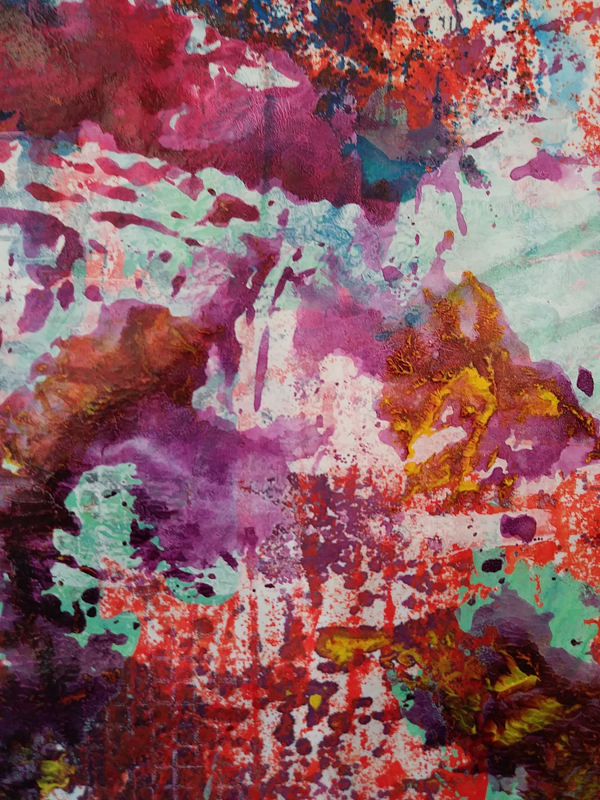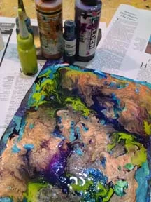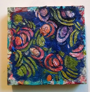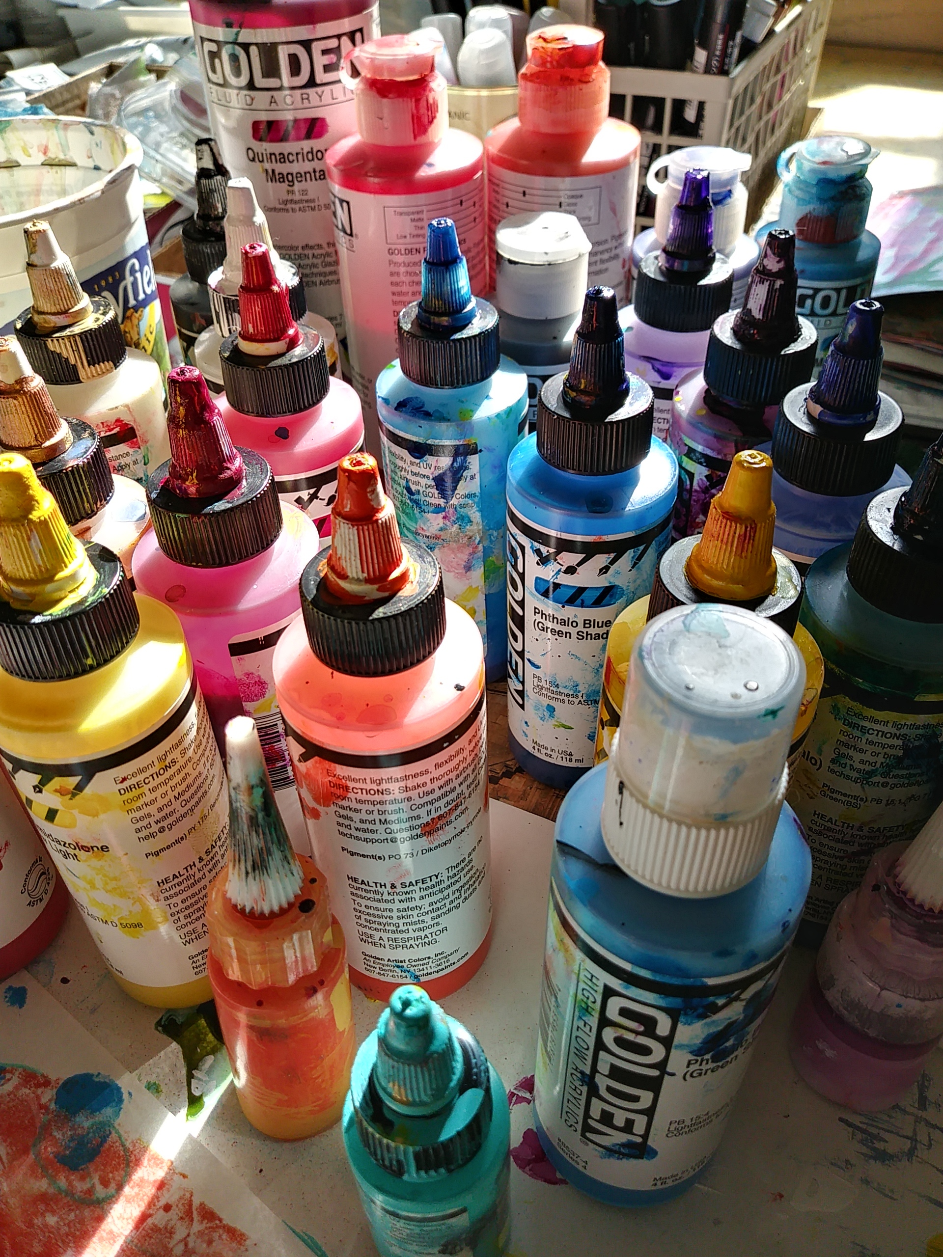
Pictured here in the morning light, these amazing paints look like little gems on my studio table. There’s so much to love about these GOLDEN High Flow paints. Their rich, intense color that flows off the brush like watercolor but is permanent when dry, and the ease of pouring, dripping and splashing this paint is just some of what makes it a “go to” paint in the studio. Because it’s highly pigmented a small amount goes a long way too.
Here are some of the ways that I work with these versatile paints.
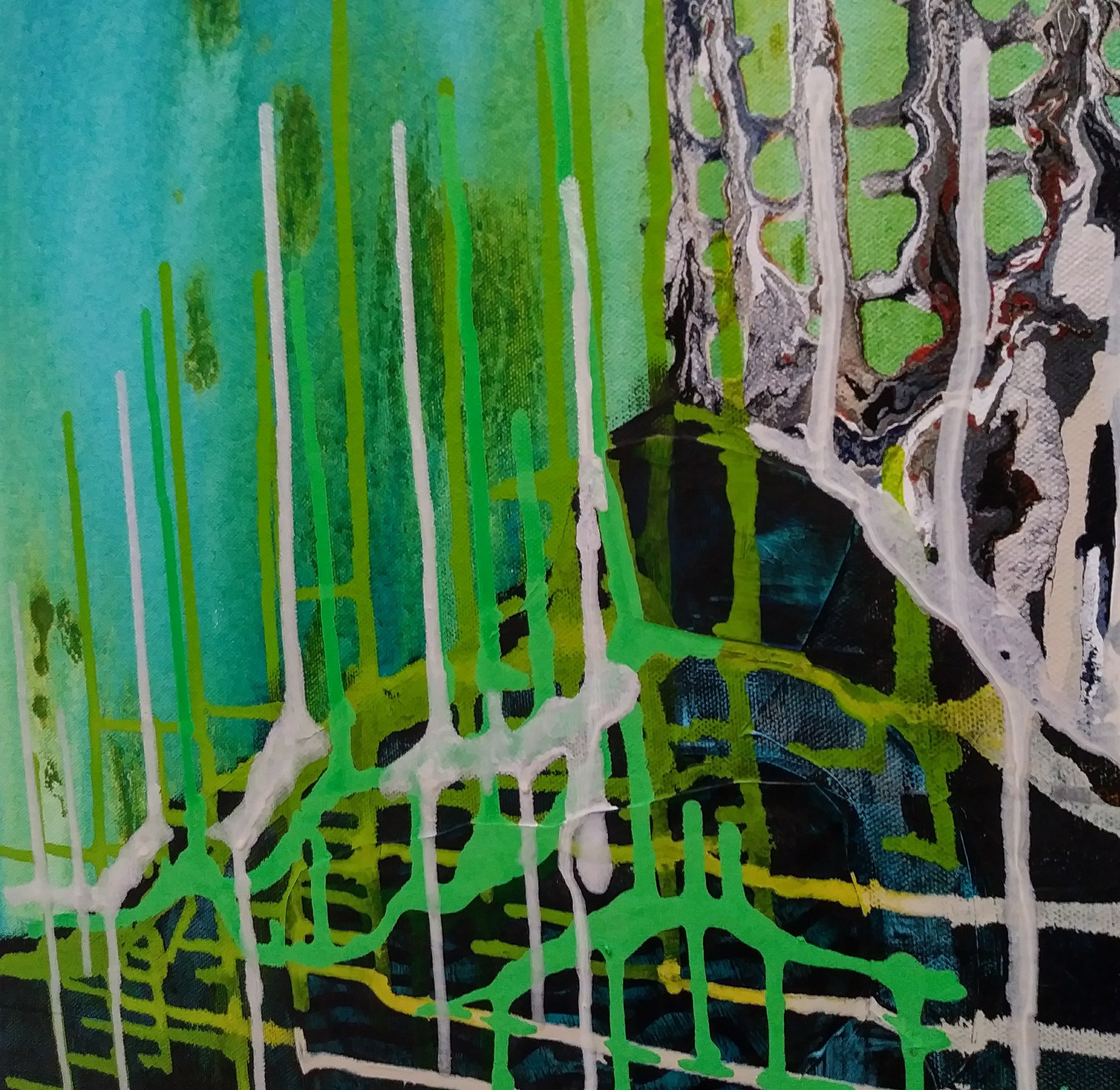
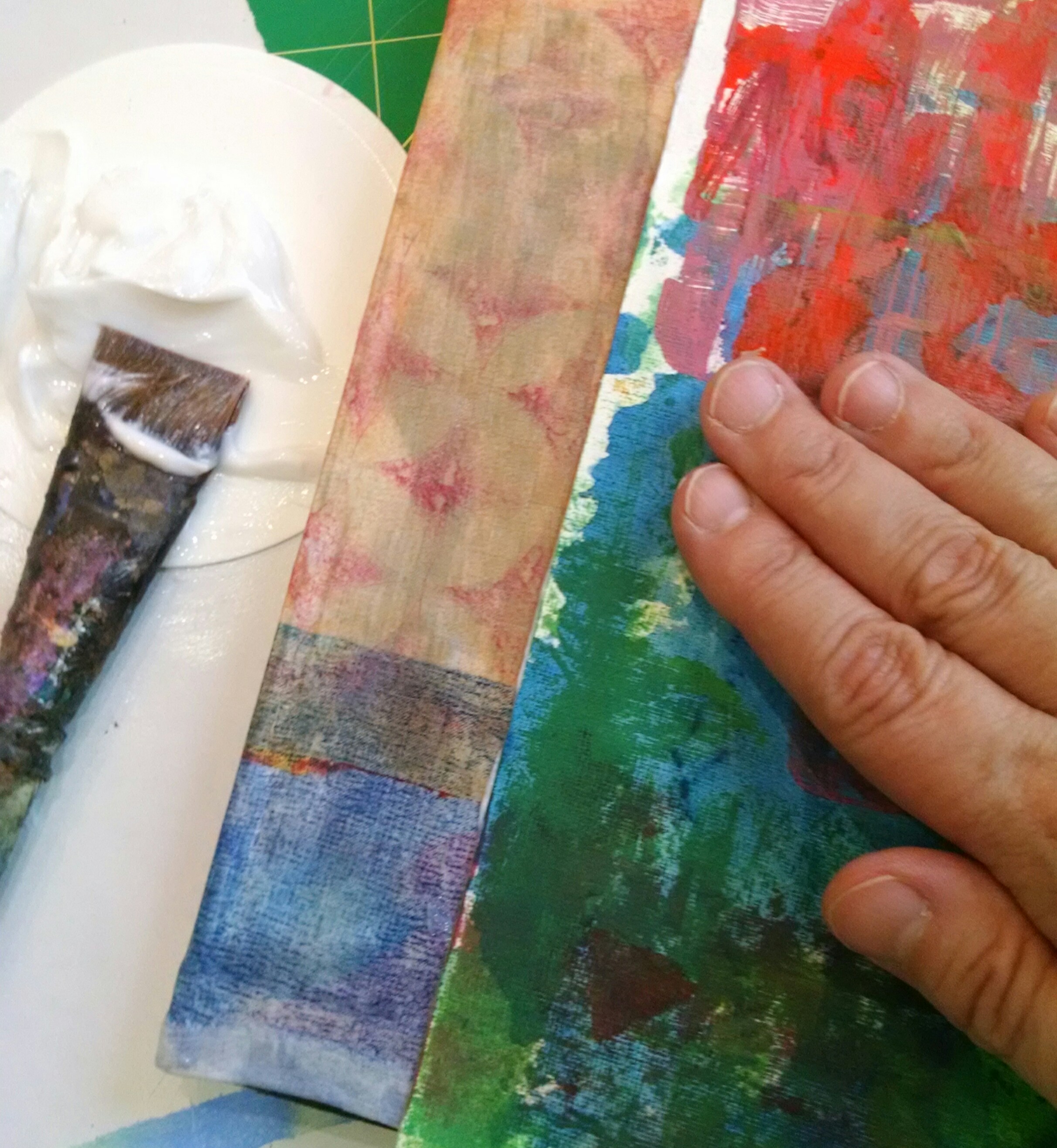
Various ways of pouring and on different surfaces (substrates)
Staining rice paper (Hosho and Kozo) and tissue for collage and finished work
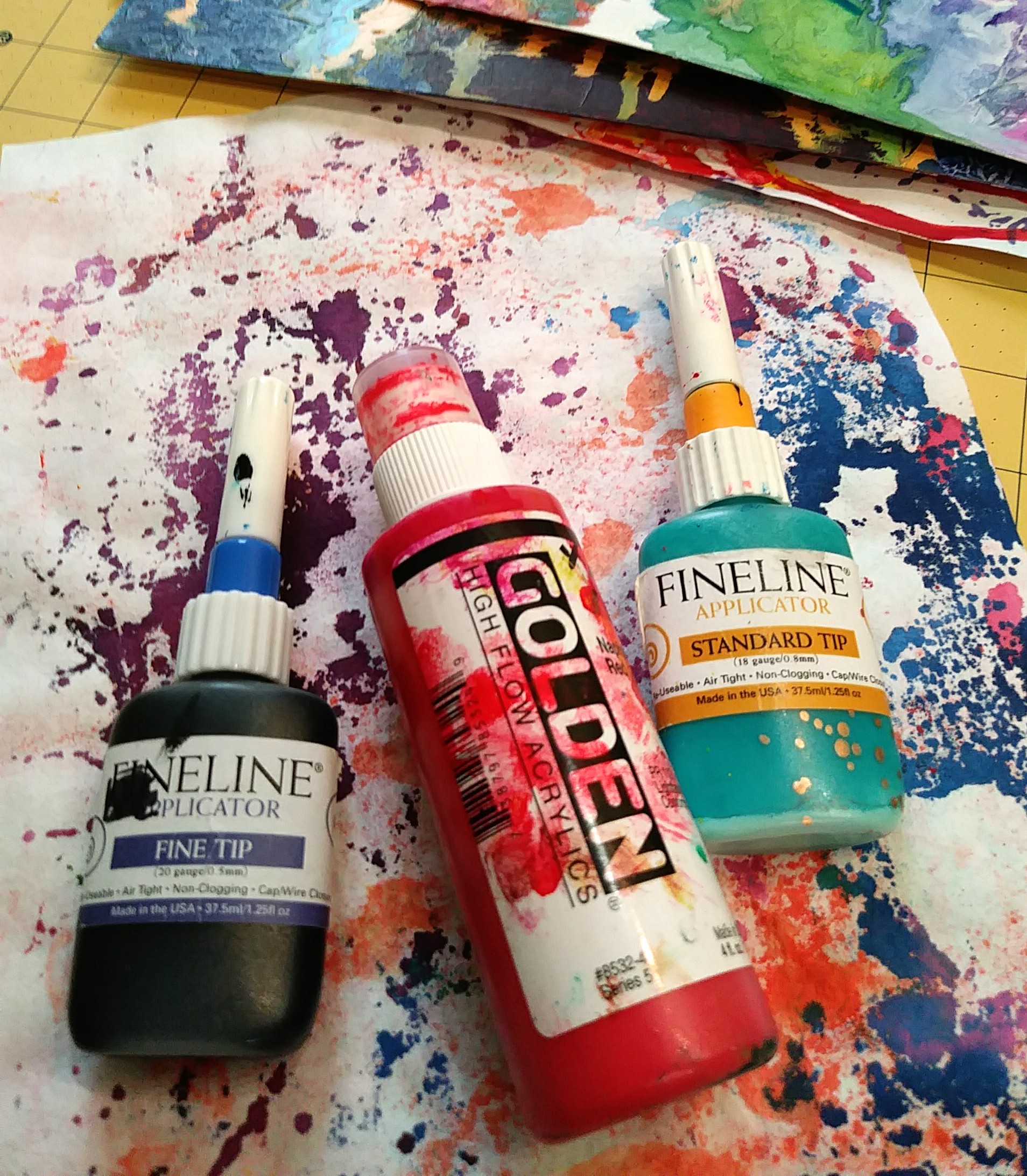
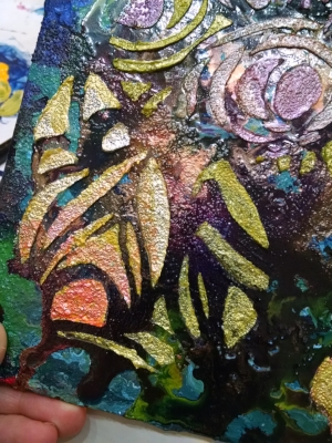
Drawing with Fineline Applicators and in refillable markers
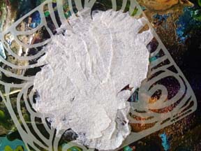
Glazing with or without glazing medium
Washes of color
Flinging paint by hand
STUDIO TIP: The High Flow Bottles have a small ball in them to help keep the paints properly mixed. It’s important to shake them vigorously prior to using. You can hear the ball rolling around when you shake the paint. I save the used bottles to make custom color mixes because of the ball. Keeping the colors well mixed is trickier without the ball.